Andoge – Micro Branding Studio (Brand Identity Reveal)
Andoge was created with a simple belief: great branding doesn’t need to be loud or oversized — it just needs to be clear, thoughtful, and memorable. The visual identity reflects that idea with bold shapes, warm character, and a playful personality that feels approachable from the first glance.
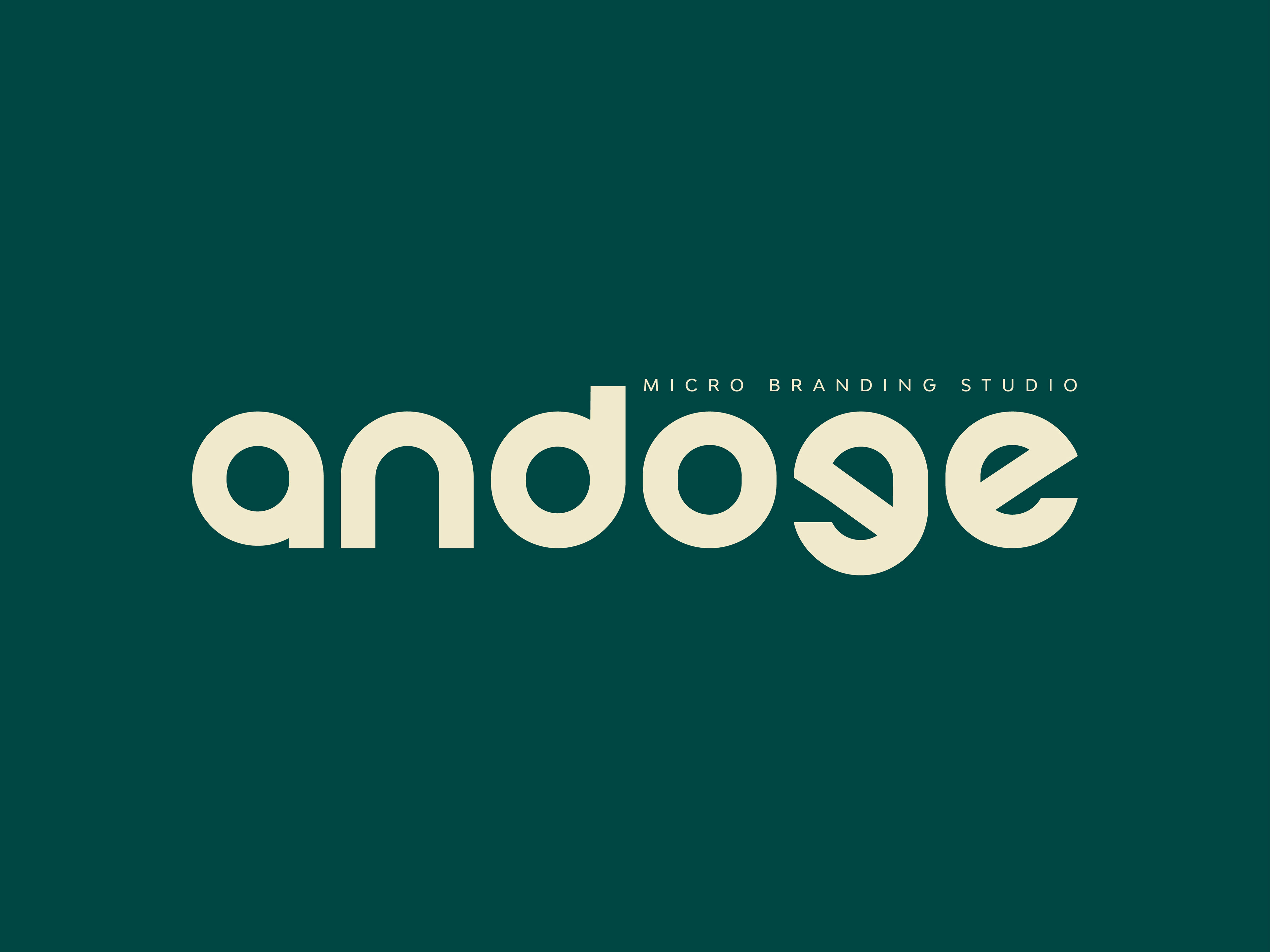
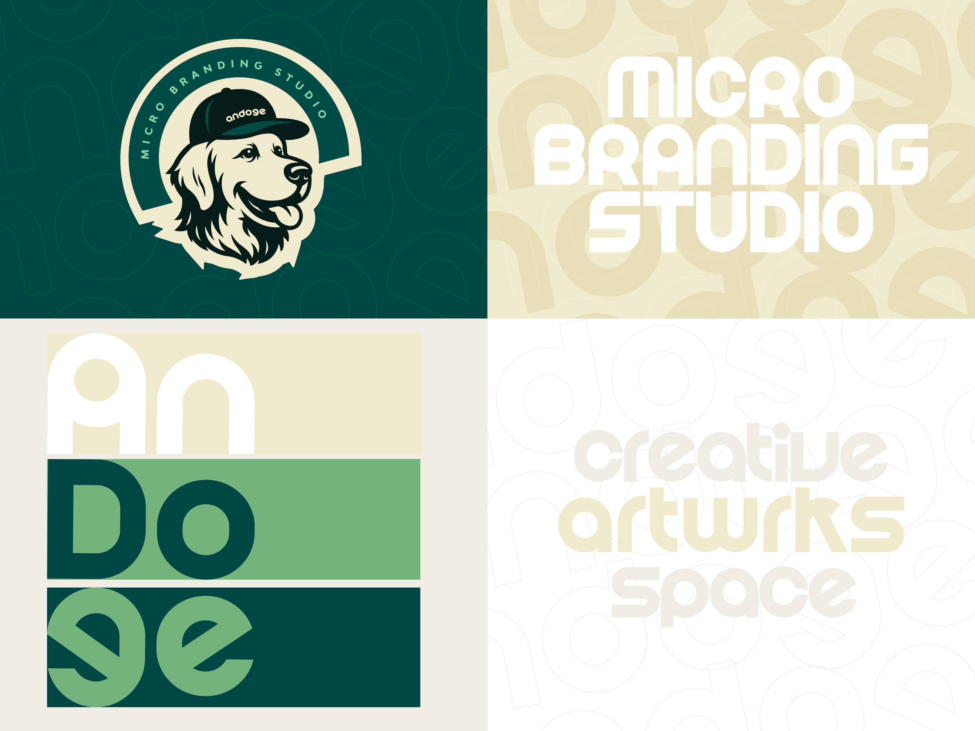
The logotype is built with soft, rounded forms and modular geometry, giving the brand a modern yet friendly look. The custom type system works like a toolkit — flexible, expressive, and easy to expand into patterns, layouts, and a wider visual language.
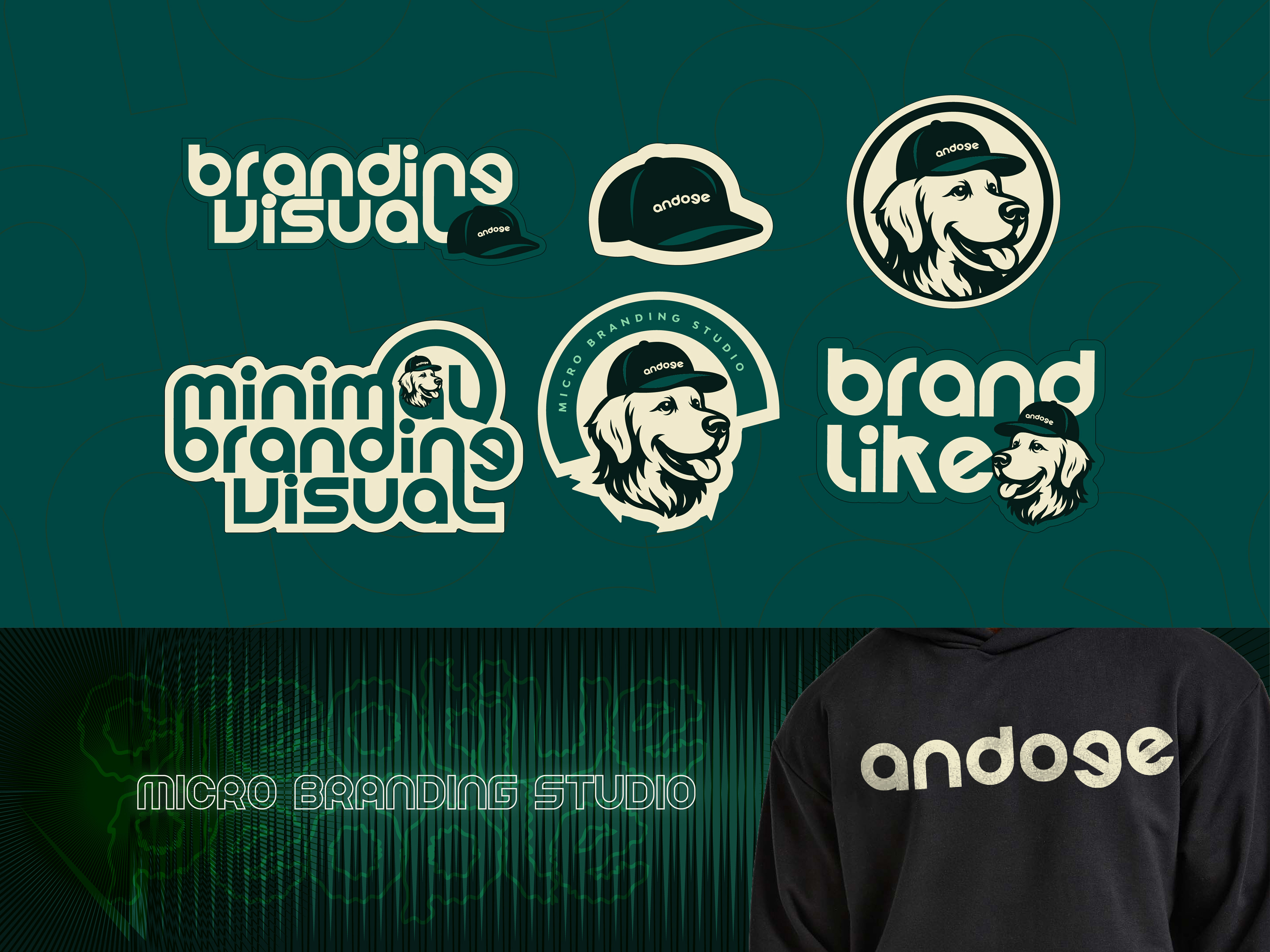
One of the most distinctive elements is the Andoge dog mascot. It represents loyalty, friendliness, and creative spirit, adding human warmth while keeping the identity fun, simple, and easy to recognize.
The color palette blends deep greens with soft cream tones, creating a mix of craft, calmness, and trust. Oversized letterforms and subtle pattern work build a consistent rhythm across the brand, helping Andoge stand out with its own visual voice.
Andoge is about:
• Micro branding with big creativity
• Clear design that feels personal
• A space where ideas are crafted with intention
• Visual storytelling that stays simple but impactful
• Clear design that feels personal
• A space where ideas are crafted with intention
• Visual storytelling that stays simple but impactful
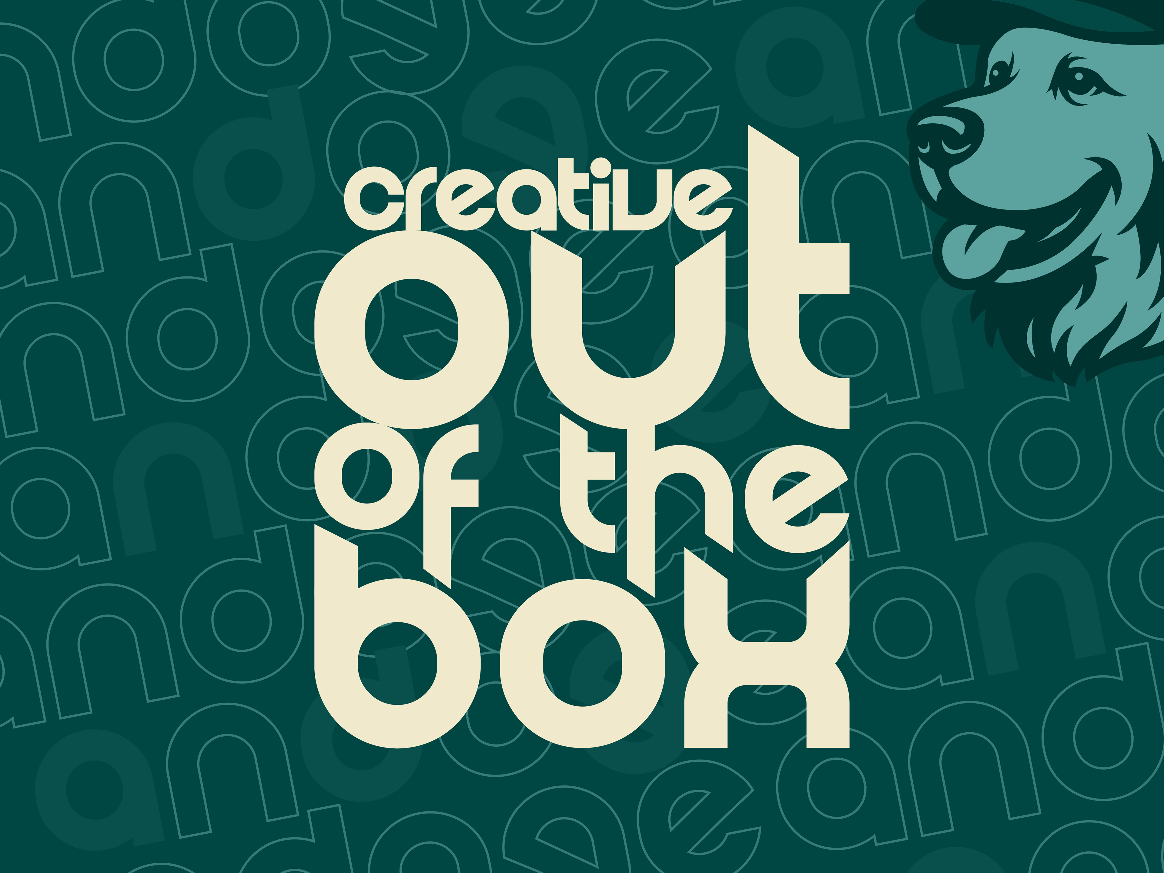
This identity shows how a small studio can still feel bold — and how thoughtful design can turn minimal elements into a strong, memorable brand world.
#BrandIdentity #DesignSystem #LogoDesign #TypographyDesign #BrandingStudio #CreativeDesign #Andoge